
Logos
Primary Logos
Stacked Logos
The stacked Long & Foster Real Estate logo is our primary logo. It appears on all Long & Foster signs and should be used for all things pertaining to Long & Foster Real Estate. The Companies logo is for materials that specifically pertain to Long & Foster Companies.
Real Estate Stacked
Companies Stacked


Cobranded Logos
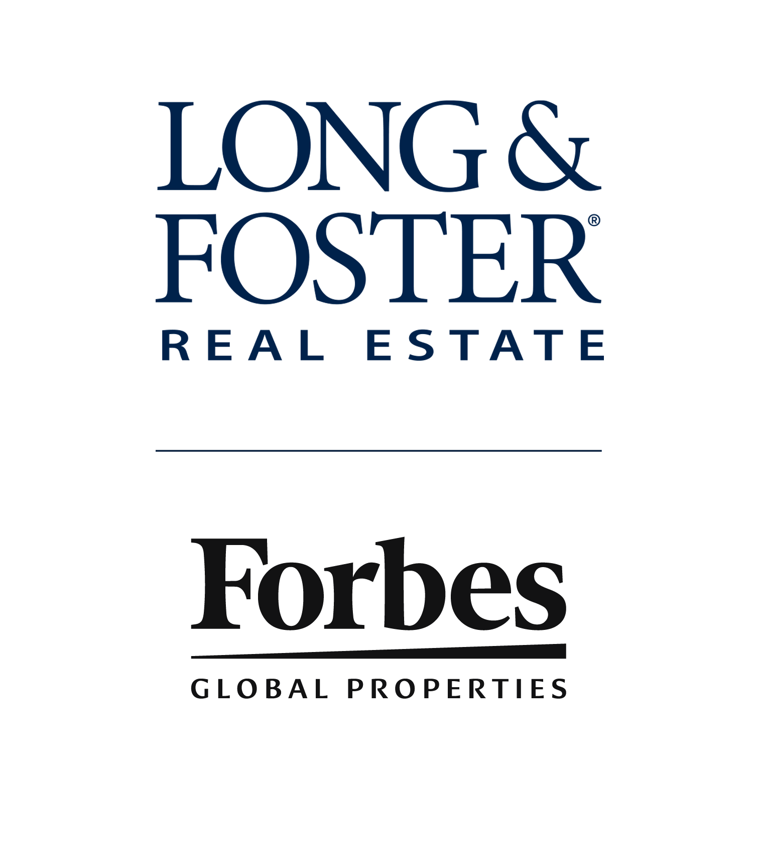
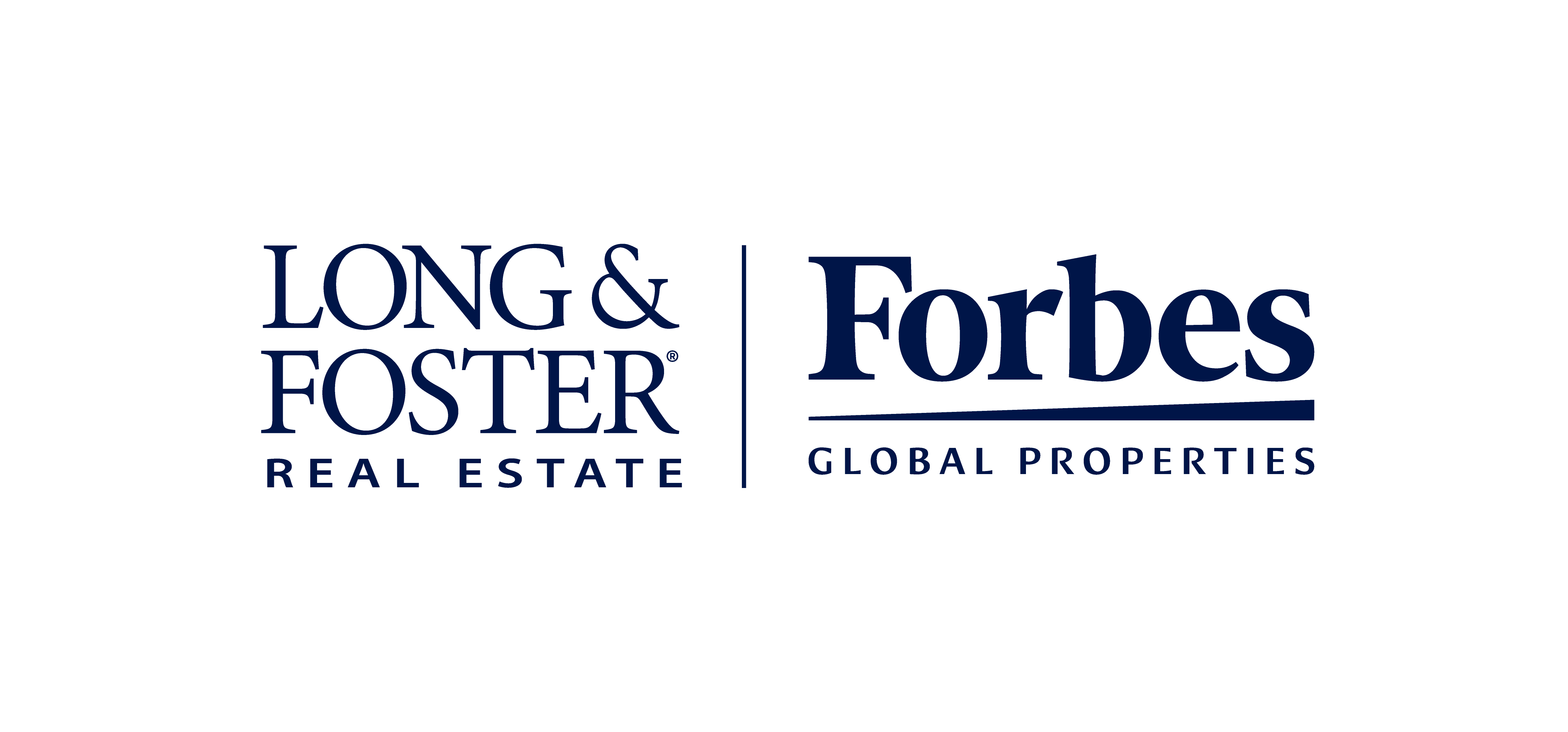
When pairing our logo with another, a rule is used as a separator between the two. Please note 60% | 40% ratio is the preferred sizing relationship, however depending on the visual weight of the partner logo, the sizing can be more evenly distributed.
Cobranded Agent
Forbes Global Properties
The Forbes Global Properties brand is reserved for listings at and above $1.5 Million.
Cobranded Forbes
Taglines & Disclaimers
Forbes Taglines
You may refer to the brand with a tagline. Use it with Long & Foster, never by itself.
- “A Forbes Global Properties member”
- “An exclusive member of Forbes Global Properties”
Forbes Disclaimers
- “[Company name] is an exclusive member of Forbes Global Properties. Forbes® is a registered trademark used under license.”
- “[Company name] is an exclusive member of Forbes Global Properties in [your location]. Forbes® is a registered trademark used under license.”
Sizing & Clearspace
Maintain a comfort zone around the logo. No copy, imagery or other graphic elements should infringe upon this area, nor should the logo be used as part of text. Please adhere to these clearspace and sizing requirements across formats.
Minimum Size
- Print 1” wide
- Digital 150px wide
Approximate Print Size
- US Paper 2” wide
- Tabloid 2.75” wide
- Poster 7.5” wide
Approximate Video Size
- 16:9 45% width of frame
- 9:16 80% width of frame
